No. 14 · Barbershop
Harbor Street Barbers
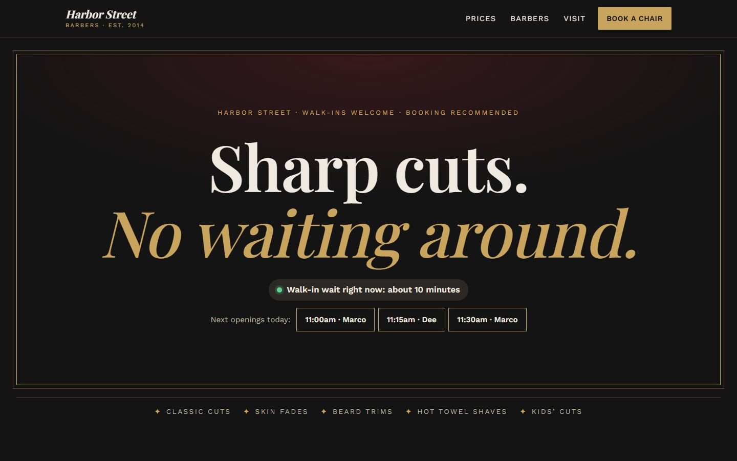
A barbershop website styled like a framed poster, with the walk-in wait, today's next openings and a four-step booking flow.
- Classification
- Independent concept
- Business
- Harbor Street Barbers (fictional)
- Project type
- Single-page website concept
- Year
- 2026
- Type
- Playfair Display, Work Sans
The brief
The brief
Design a website for an established neighborhood barbershop. Clients either want to walk in or book a specific barber, and both want to know how long they'll wait. The site should look as sharp as the cuts, show the prices plainly and make booking fast on a phone.
Goals
- 01Answer "how long is the wait?" before anything else
- 02Show prices and times like the board in the shop
- 03Let clients book a specific barber or the first available
- 04Keep booking one thumb away on a phone
On every screen
Designed for phones first


The work
The approach
The hero is a framed poster: a thin brass border, big serif type and nothing else to distract. Directly under the headline, it answers the two questions every client has: how long is the wait right now, and when can I get in? The next three openings are buttons; tap one and it’s filled in on the booking form.
Playfair Display in italic brass gives it the feel of a traditional shop sign; Work Sans in small capitals handles the practical parts. Black, brass, bone and a touch of wine keep it classic without leaning on barber-pole clichés.
Decisions worth noting
- Prices like the board in the shop. Services, times and prices are laid out with dotted leaders, the way clients already read them.
- Book a person, or the first available. The flow asks for service, barber, then day and time. Booked slots are grayed out and crossed through, so nobody picks a time that isn’t free.
- One thumb away. A sticky “Book a chair” bar stays at the bottom of the screen on phones.
- No photos needed to launch. Each barber gets a monogram in a brass ring until real portraits are ready.
How it’s built
One static page. Slots are generated in the browser, with a fixed pattern for “booked” times so the demo looks the same on every visit. Every choice is a real radio button. Fonts are self-hosted.
What would change for a real client
A connection to the shop’s booking system (such as Square Appointments or Booksy) for real availability, real barbers and photos, and live wait times from the front desk.
What’s on the site
Features actually built
- Framed poster hero with the walk-in wait and today's next three openings (tap one to book it)
- Price board with services, times and sample prices
- Sideways-scrolling row of barbers with arrow buttons
- Four-step booking flow (service, barber, day and time, details) with 15-minute slots and booked times shown
- Sticky "Book a chair" bar on phones
- Booking request (demonstration only, nothing is sent)
Palette
- Black
#141414 - Brass
#C9A45C - Bone
#EFE9DF - Wine
#7A1F2B