No. 04 · Landscaping
Hollowbrook Landscapes
A calm, image-led website for a small landscaping crew, built around the seasons so customers can see what their garden needs and when.
- Classification
- Independent concept
- Business
- Hollowbrook Landscapes (fictional)
- Project type
- Single-page website concept
- Year
- 2026
- Type
- Bodoni Moda, Karla
The brief
The brief
Design a website for a small garden design and care business that wants fewer one-off mowing calls and more year-round clients. Homeowners need to trust the crew's taste, understand what happens in each season, and request a free garden visit without a long form.
Goals
- 01Show taste and care without relying on stock photos
- 02Explain year-round care, season by season
- 03Make the first step (a free garden visit) easy and low-pressure
- 04List the towns the crew covers
On every screen
Designed for phones first


The work
The approach
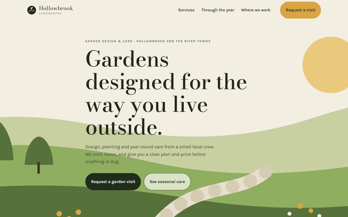
Landscaping is sold on taste, and most landscaping sites try to prove it with stock photos of perfect lawns. We went the other way. A layered landscape illustration, drawn in code, sets a calm mood in the first screen. Bodoni Moda, a high-contrast serif, gives the headlines the feel of a garden book.
The center of the page is a season switcher. Customers don’t know what a garden needs in October, so the site shows them, one season at a time. That moves the conversation from “can you mow?” to year-round care.
Decisions worth noting
- A free visit, not a price grid. Garden work depends on the site, so the main action is a no-obligation walk around the yard.
- Roman numerals for services. A small editorial detail that suits the serif and sets the site apart from template service grids.
- Size cards instead of a dropdown. “Small / Medium / Large” with a short description is faster to answer on a phone than measurements.
How it’s built
One static page. The season switcher follows the standard accessible tabs pattern: arrow keys move between seasons and the panel is announced to screen readers. The illustrations are inline SVG, so the page loads no image files. Fonts are self-hosted.
What would change for a real client
Real photos of finished gardens (a before-and-after slider works well here), reviews from the business’s Google profile, and a form connected to the owner’s inbox or scheduling tool.
What’s on the site
Features actually built
- Full-width landscape illustration made in code, with no photos to load
- Six numbered services in an editorial two-column list
- "Through the year" season switcher built as accessible tabs (arrow keys, Home and End)
- Three-step "how a project grows" section
- Service-area list
- Garden visit request with size cards and interest checkboxes (demonstration only, nothing is sent)
Palette
- Forest
#1F2D1C - Moss
#56723A - Cream
#F3EEE2 - Ochre
#D9A441